Nexus Global Logistics

Challenge
NGL was preparing to enter a sector dominated by large international players. As a newcomer, they lacked visibility and a system to present themselves with authority. Their ambition was clear: to compete on speed, reliability, and service flexibility.
What they needed was a brand strong enough to carry that ambition into every conversation, from fleet partners to enterprise clients.


Solution
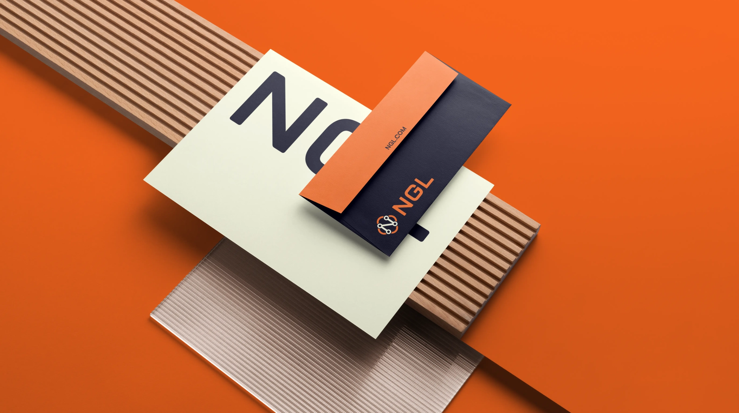
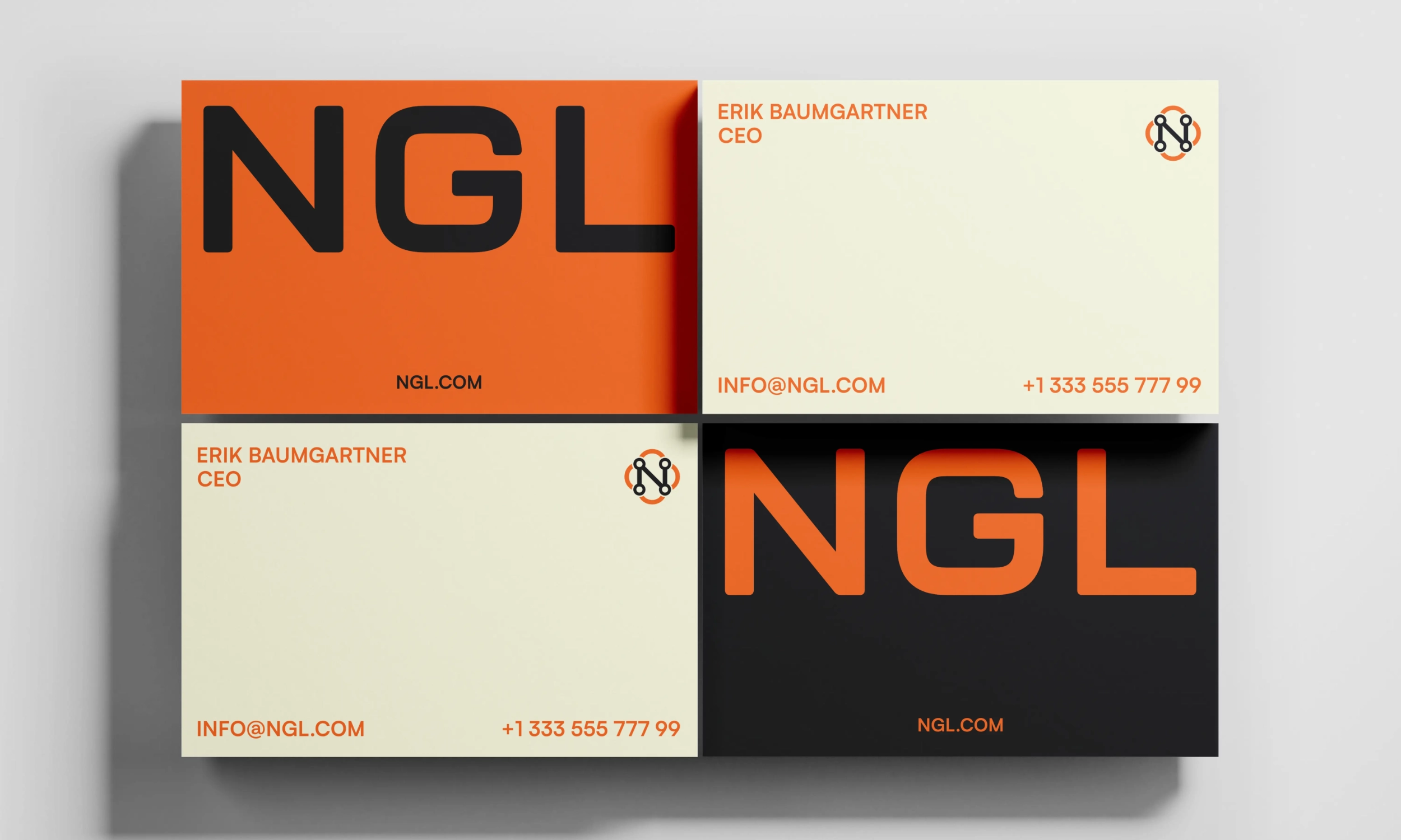
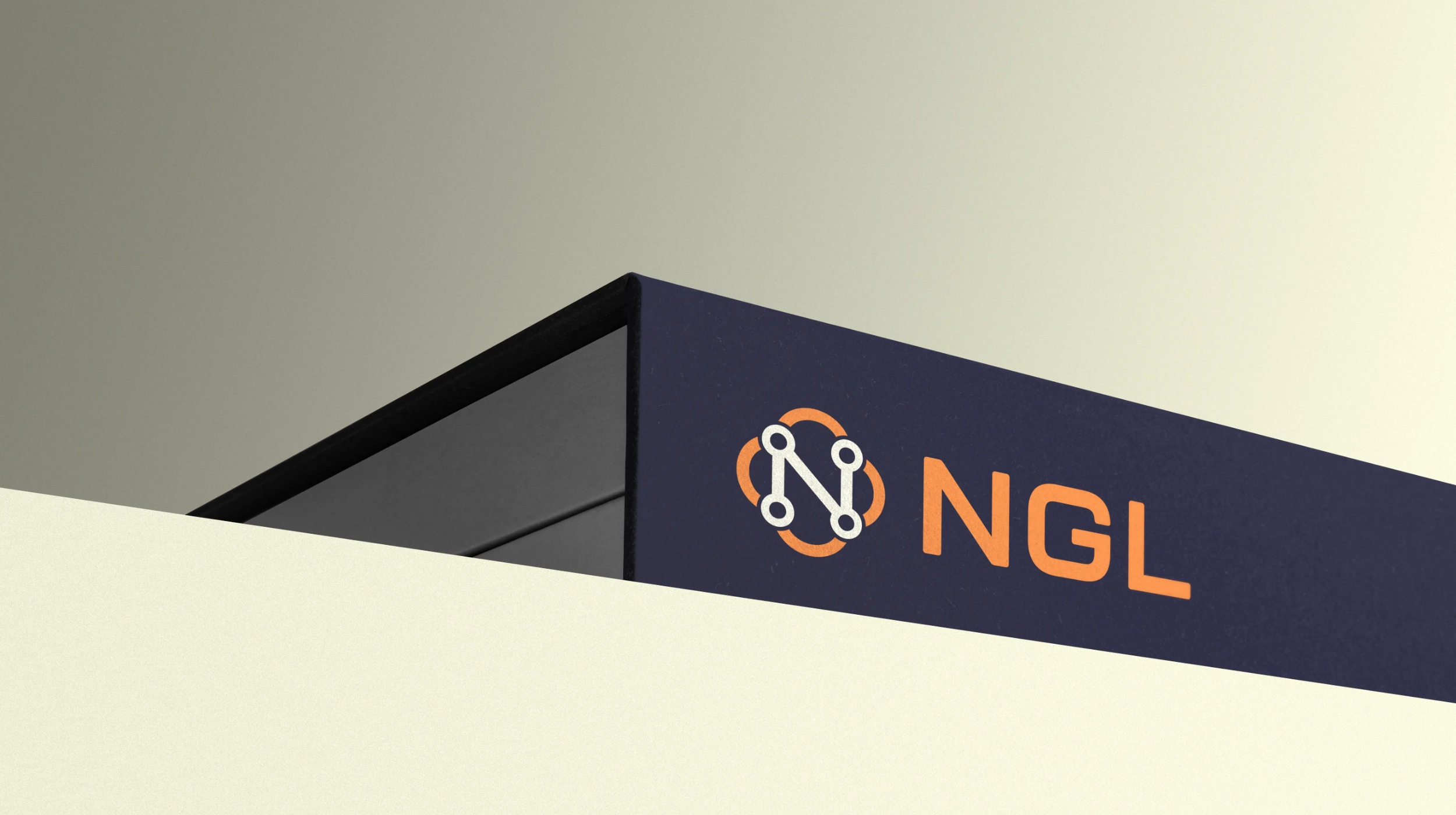
We built a brand framework that conveyed direction and scale. The mark was constructed around the letter “N” as a network, reflecting routes, connections, and constant movement. A palette anchored in deep Midnight with a vivid Signal-Orange accent created immediate recognition, while a structured typographic system and clear spacing rules ensured discipline across every asset.
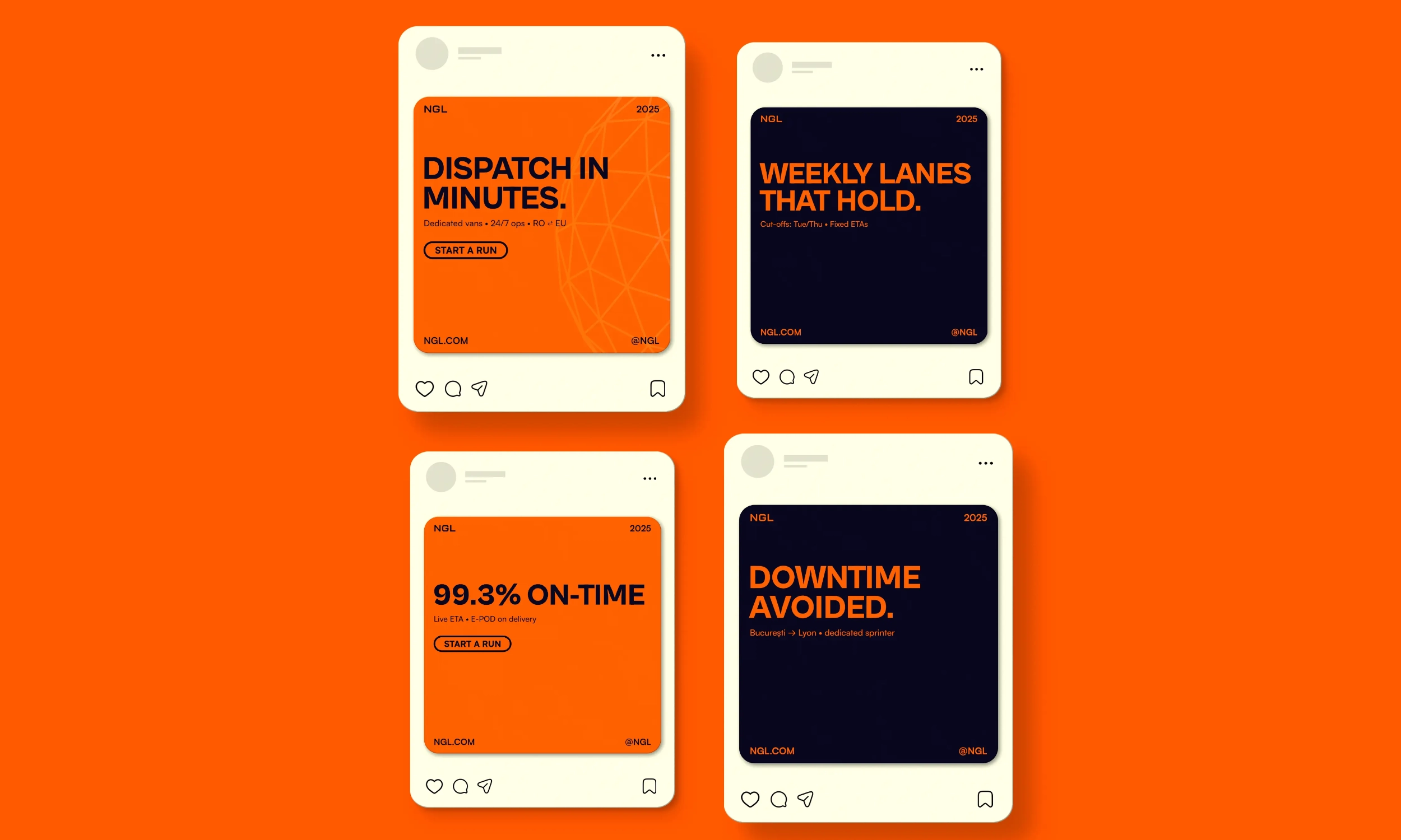
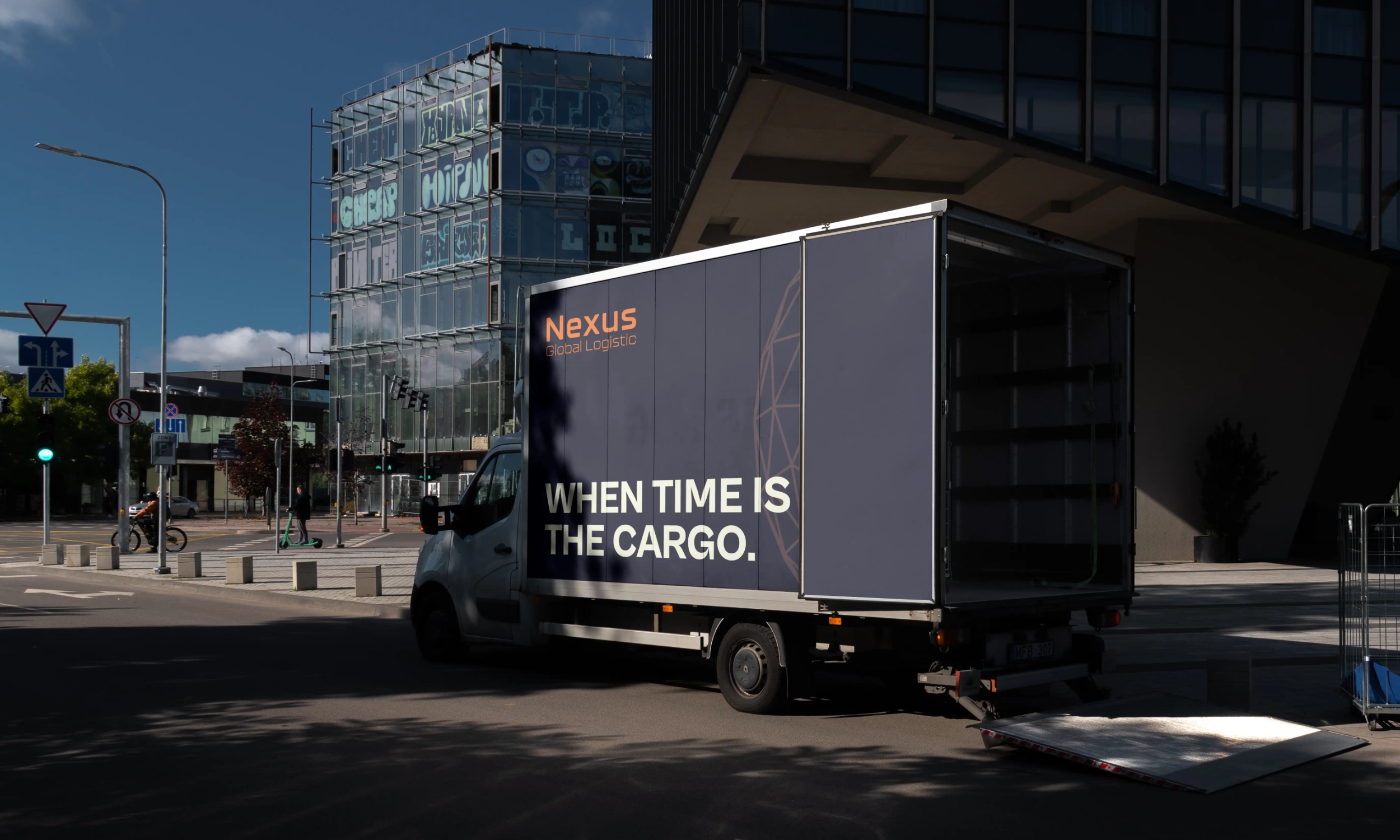
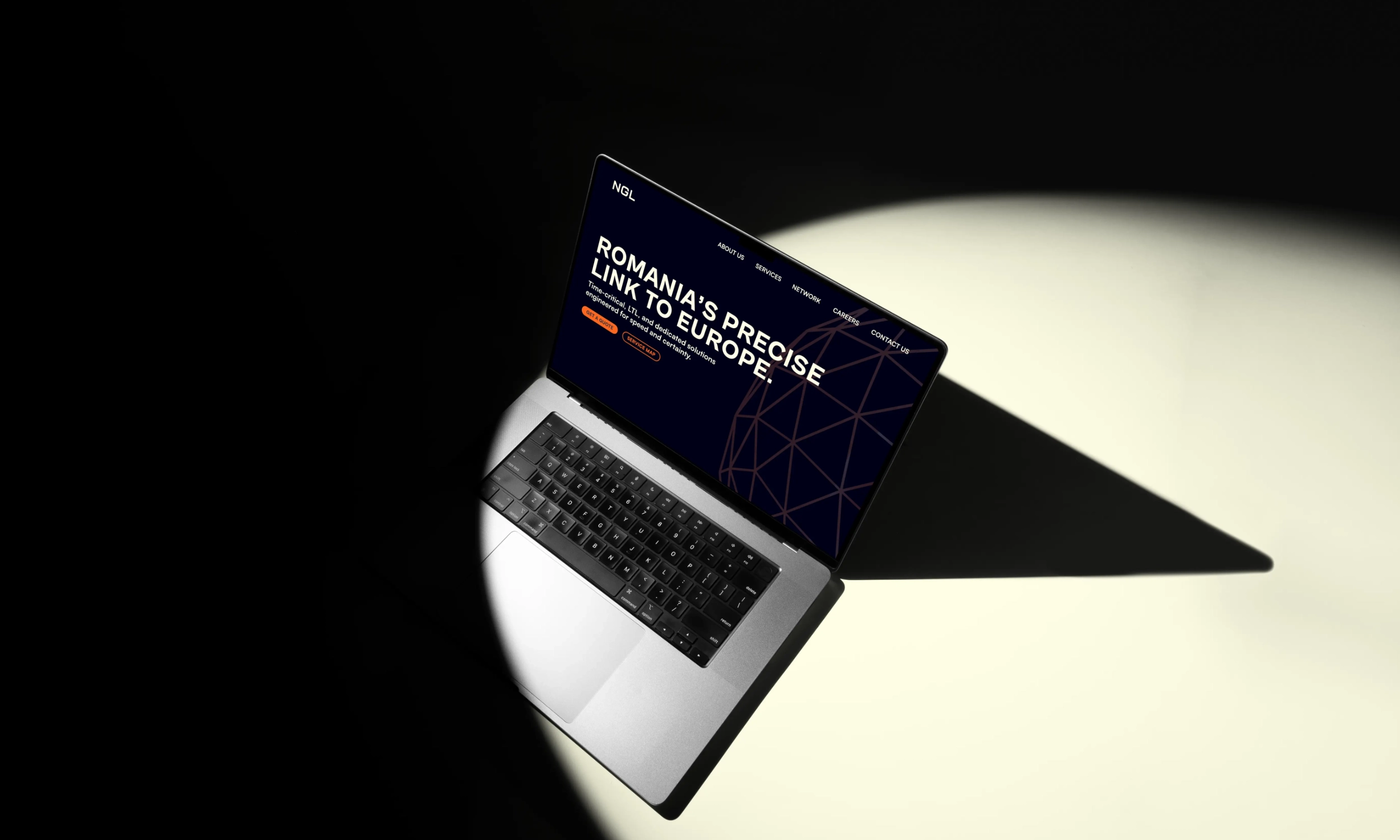
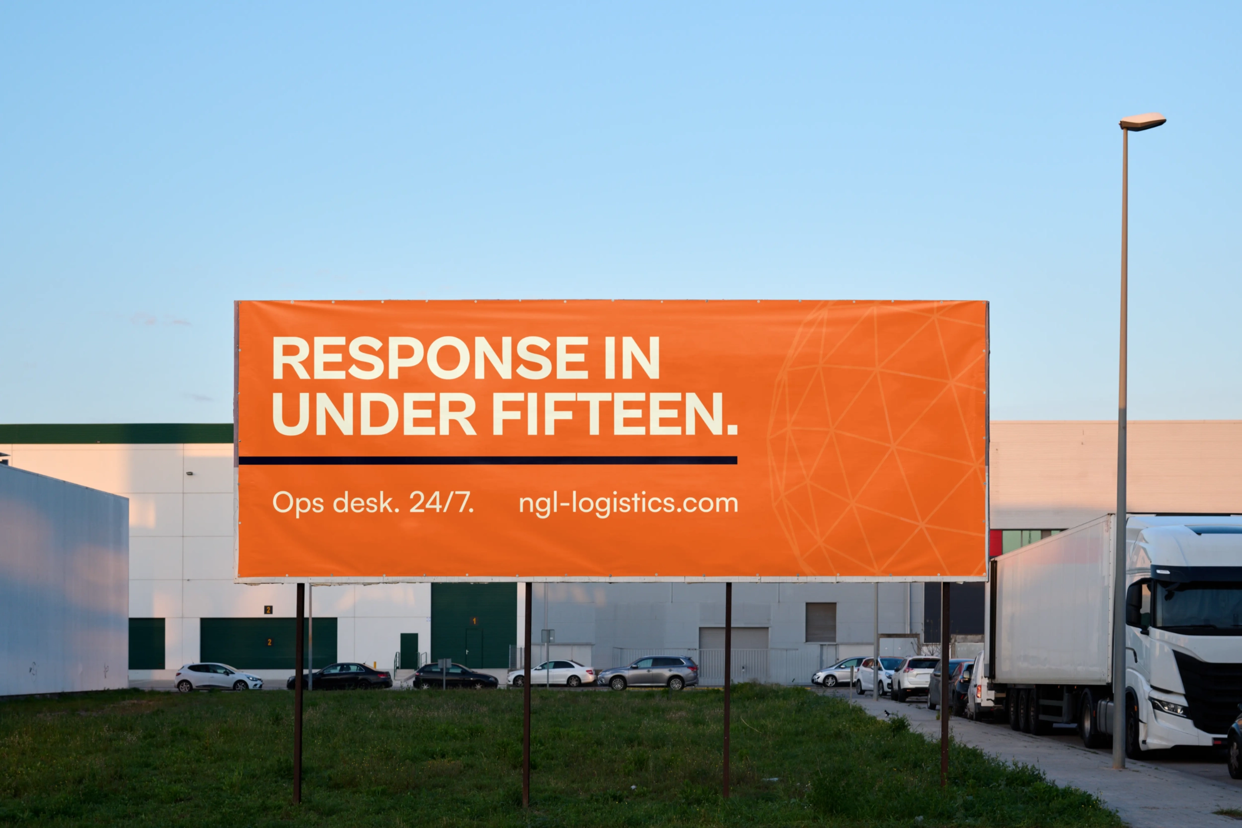
The framework was translated into practical applications: vehicle livery, signage, proposals, social communication, and a website that foregrounded their core offers including time-critical delivery and weekly LTL lanes. The brand story shifted from aspiration to proof, giving NGL the credibility to enter the market with confidence.

Result
NGL launched with an identity that projected scale and precision. Their message became sharper, their visuals consistent, and their proposals easier to produce. Prospects and partners saw a company that looked established from the start, with the systems and clarity to deliver on its promises.
The brand did what the business needed most: open doors in a competitive market.