Challenge
Educator entered the UK market as a start-up with no existing identity and a high-stakes mission: to guide young people through the complexities of higher education. Students needed help not only with choosing courses but also with managing paperwork and finances.
Competing organisations looked institutional and unrelatable. Educator needed a brand that could speak directly to a younger audience while remaining credible to parents and partners.


Solution
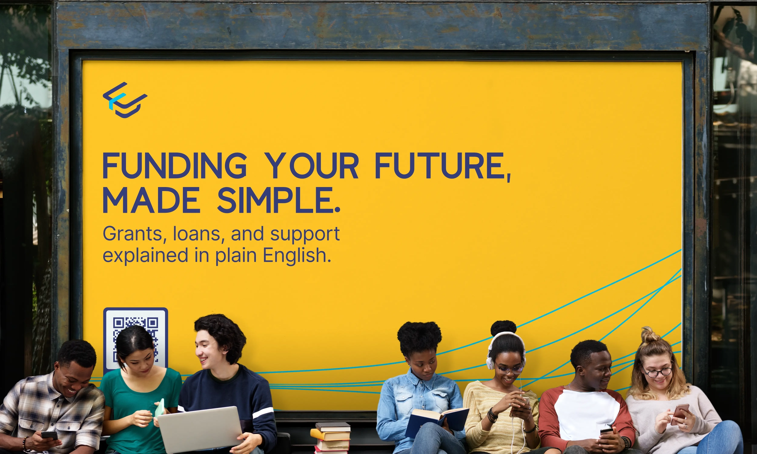
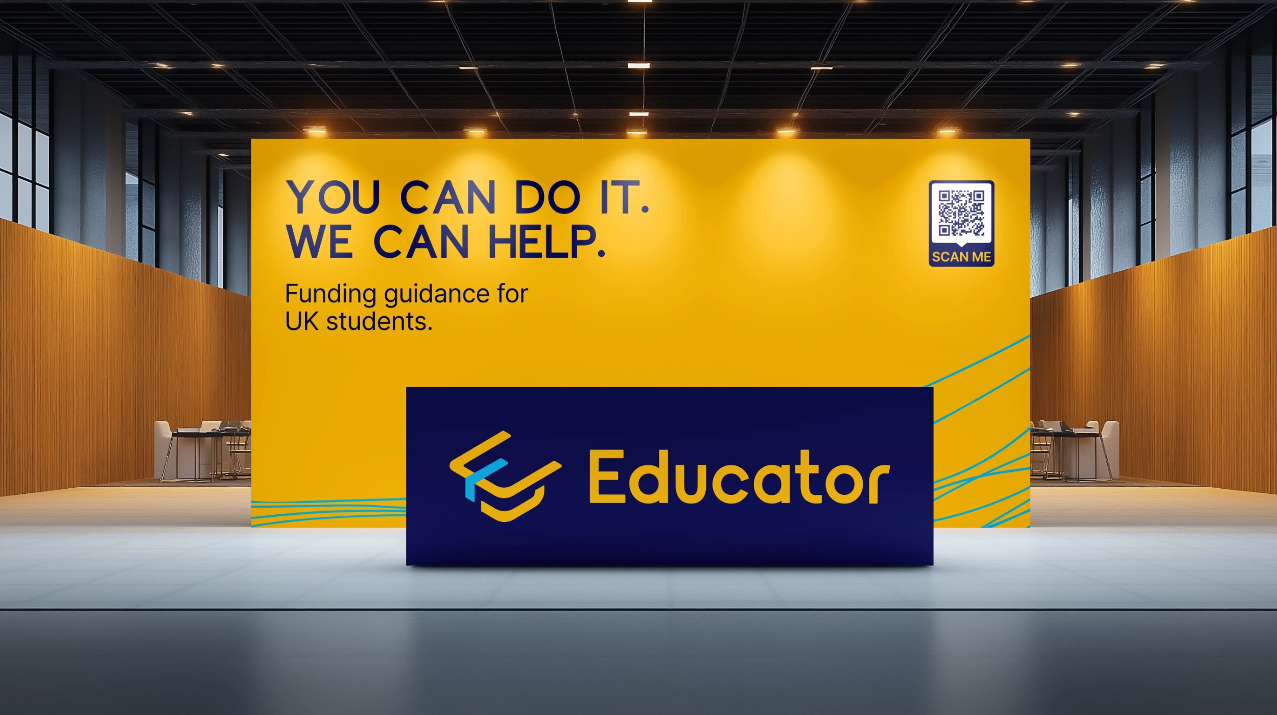
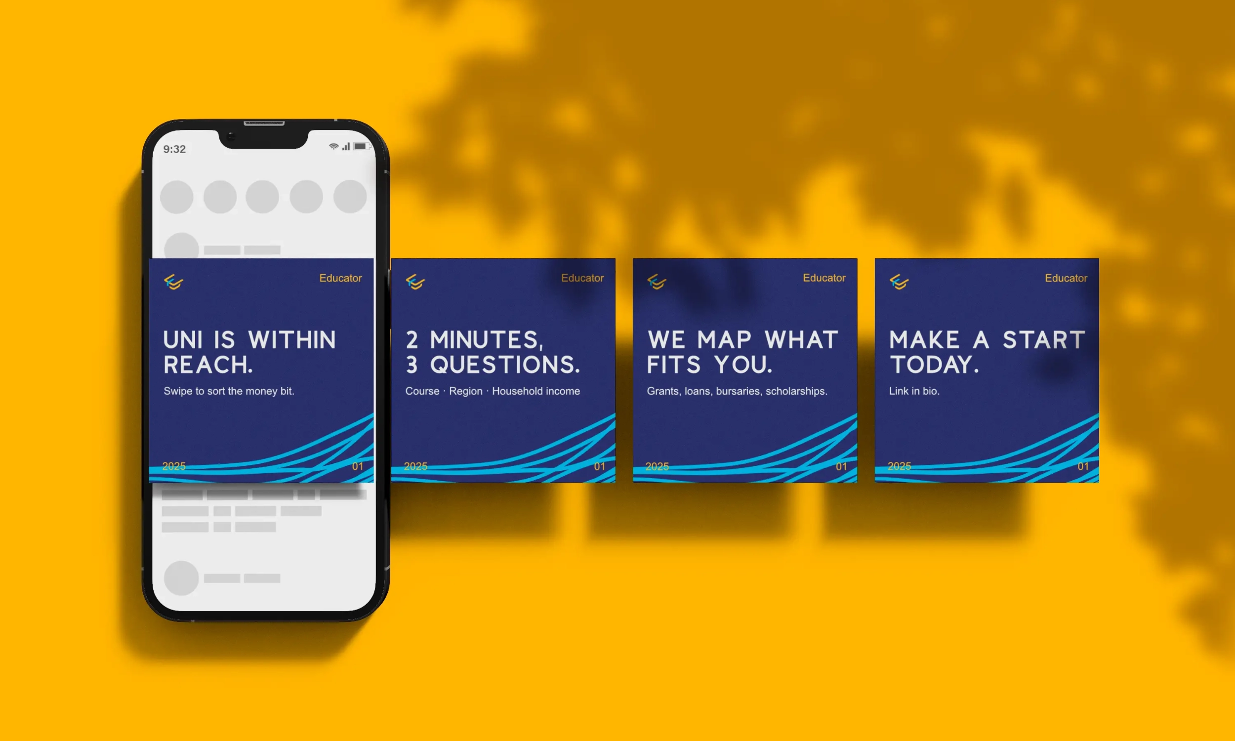
We built the brand from scratch with clarity and accessibility at its core. The mark combined the shape of a cap and the letter “E”, a symbol of achievement and progress. A bright Sun yellow paired with a deep Navy created impact in both digital and street environments, while a supporting accent of Cyan signalled modernity.
The visual system was extended into every channel: proposal decks, student materials, social templates, and a website designed to move students seamlessly from interest to application. Typography and grids were set for easy readability, ensuring every piece of communication felt approachable. Copy was written in plain language to keep focus on outcomes, support, and simplicity.


Result
Educator launched with an identity that felt energetic yet trustworthy. The brand gave students an approachable ally, parents a reliable partner, and partners a professional organisation they could collaborate with.
The system scaled easily across print, digital, and in-person touchpoints, helping Educator establish credibility quickly in a competitive sector.