BSH Spedition

Challenge
A new logistics company entering a crowded market with no brand to stand on. No identity, no website, no content system, and nothing a fleet vendor or sales team could reliably use.
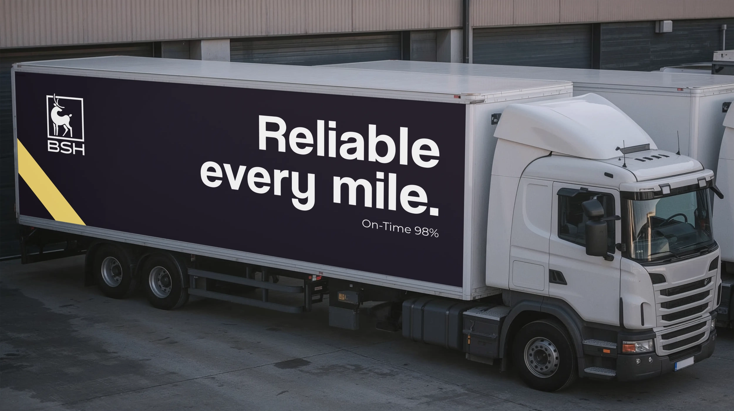
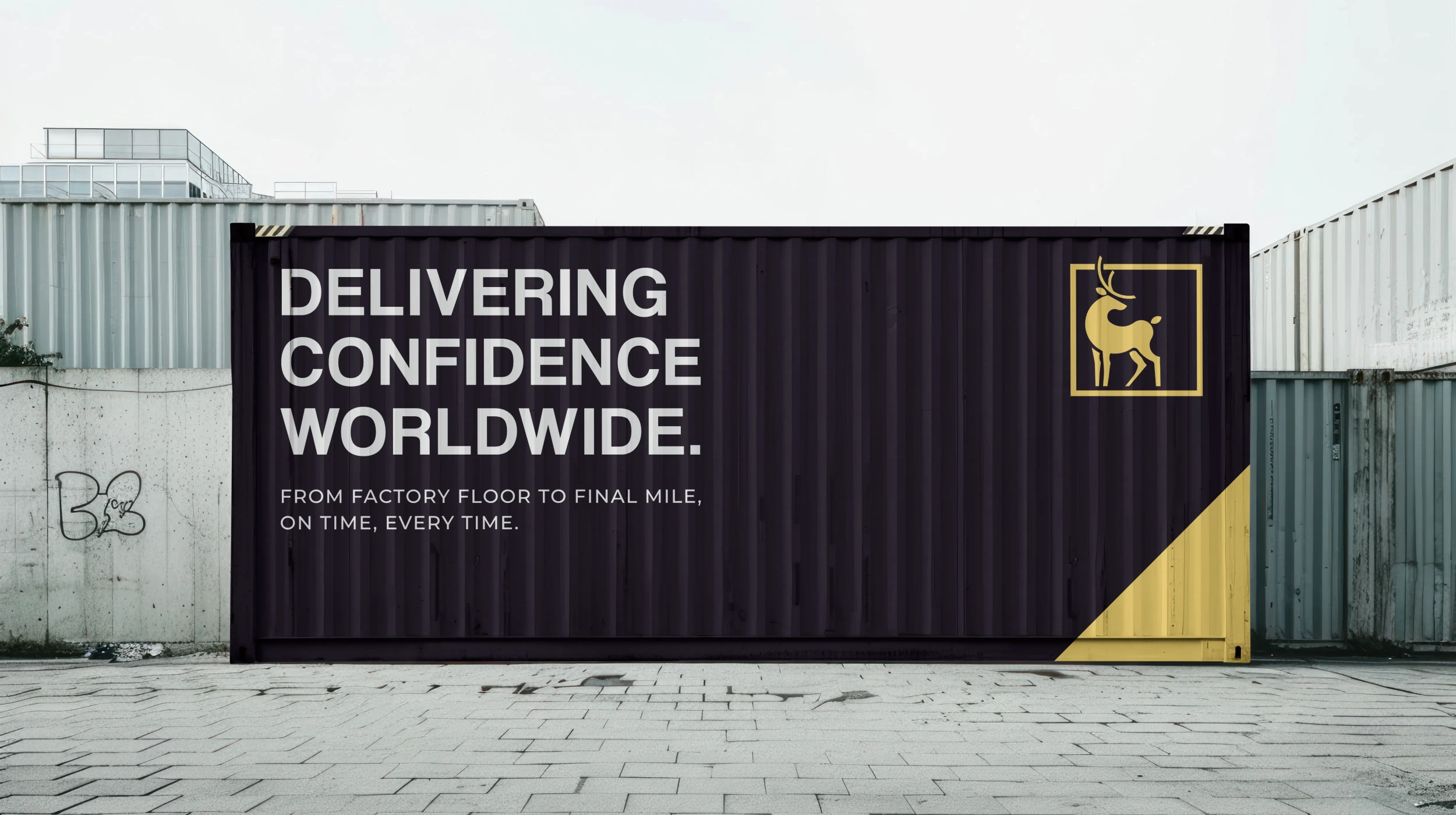
They needed credibility from day one and a brand that could live on trucks, documents, the site, and social without falling apart.

Solution
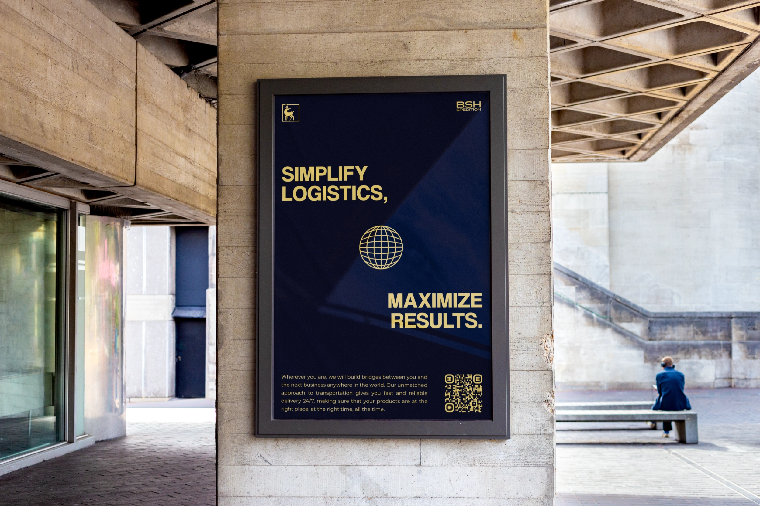
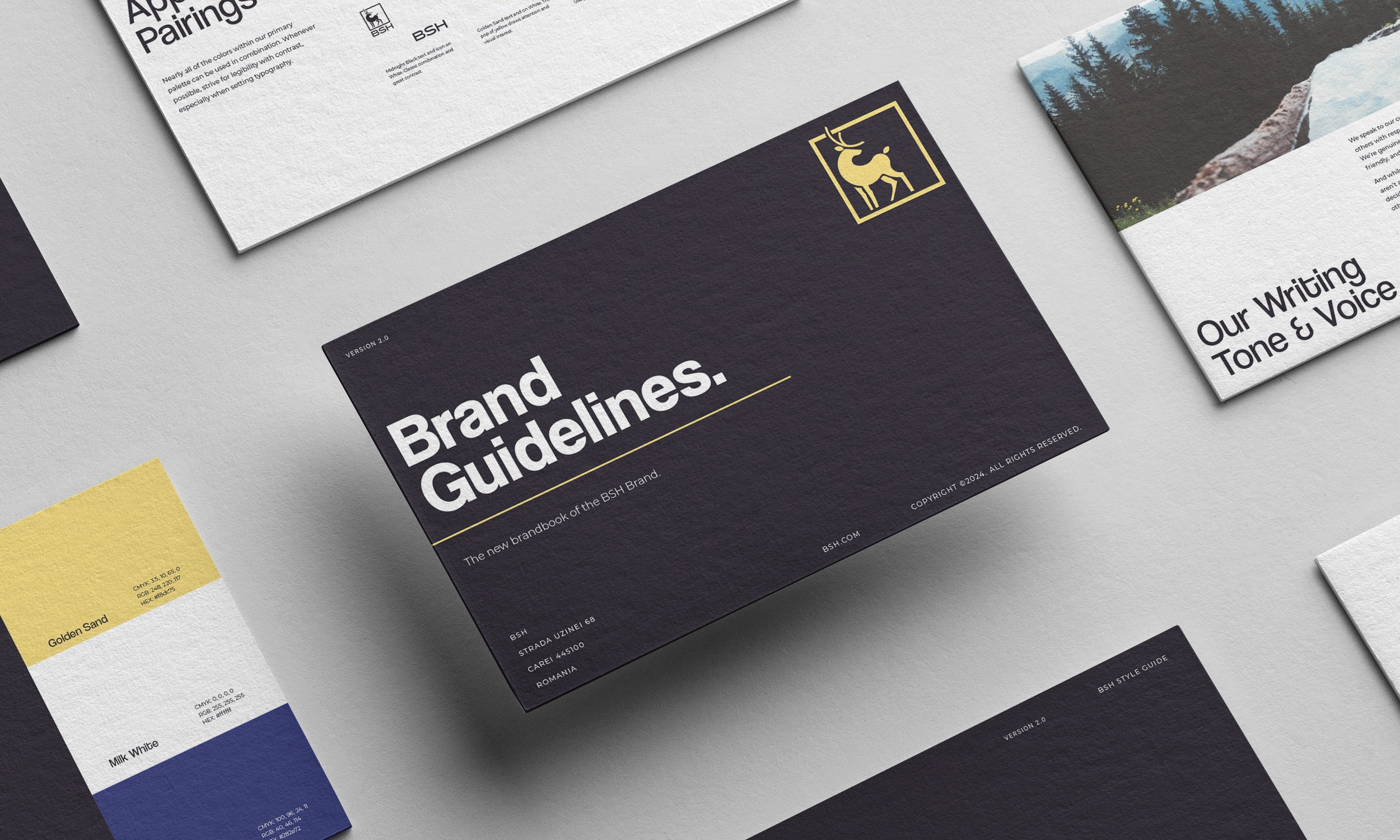
We built the brand from first principles. Positioning and messaging defined the promise; the caribou-in-frame mark encoded endurance and safe passage. We set an ink-and-signal-yellow palette for high visibility, a neo-grotesk type scale, an 8-pt grid, and accessible contrast rules.
We translated the system into operations: livery standards, components for web and print, a clear site narrative around lanes and SLAs, and a content engine for ongoing social. Governance wrapped it all so vendors and the internal team could execute without guesswork.
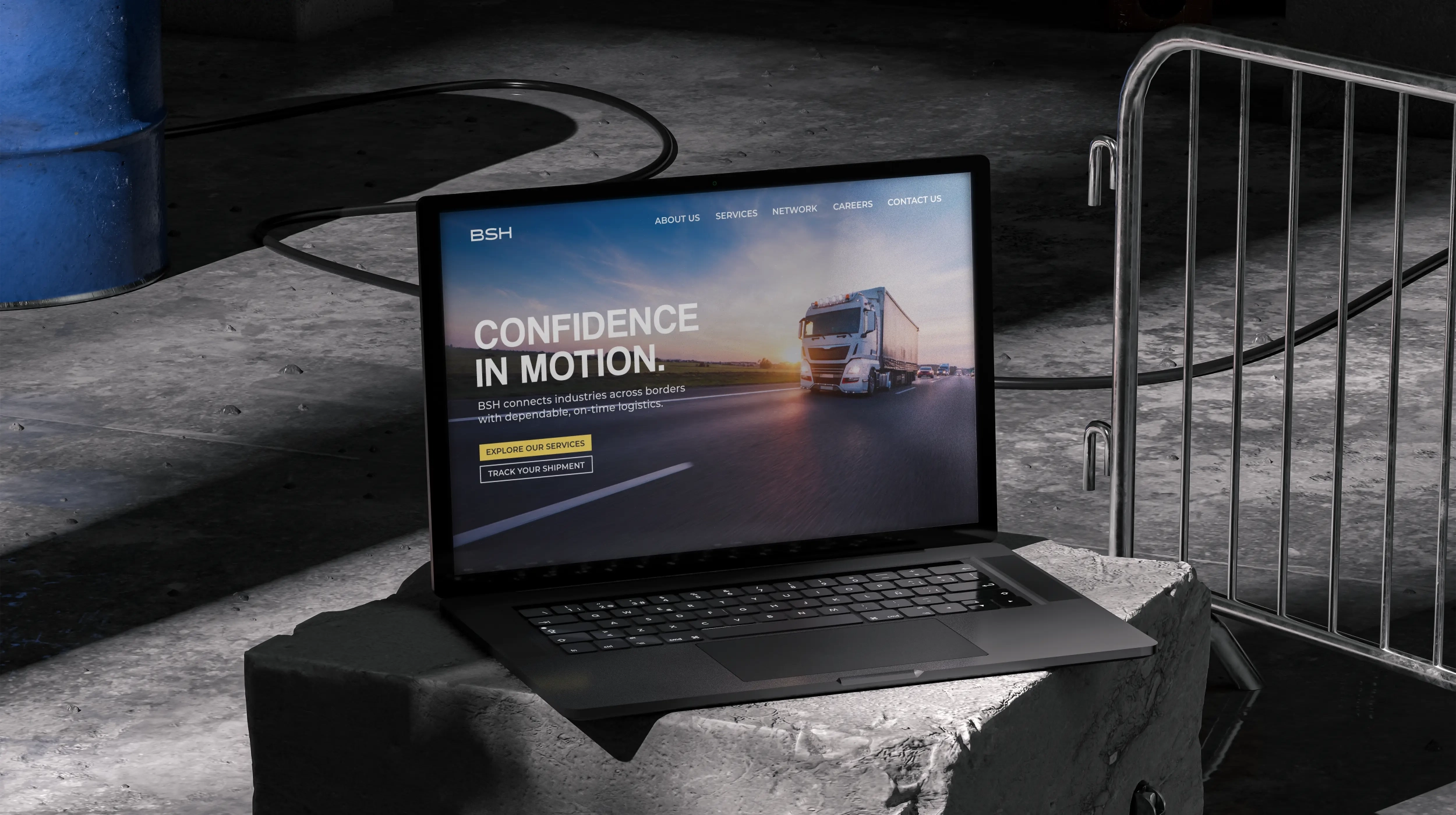
.webp)

Result
A launch-ready identity that travels cleanly from fleet to screen. Production got faster, briefs got simpler, and every touchpoint told the same story.
Recognition and enquiries improved, and the team kept momentum through a maintained website and a steady social cadence. The brand didn’t just look the part — it worked like the business from day one.