Challenge
Ares operates in one of Hungary’s most saturated markets. Their old branding looked generic, lacked distinction, and failed to support growth. Every proposal and piece of signage was made from scratch, creating inconsistencies and slowing down delivery.
They needed a brand with real presence, one that could help them cut through the competition and hold together across every touchpoint.


Solution
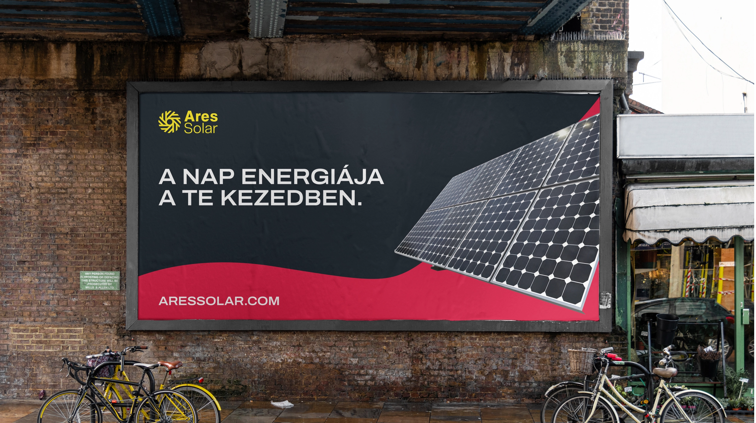
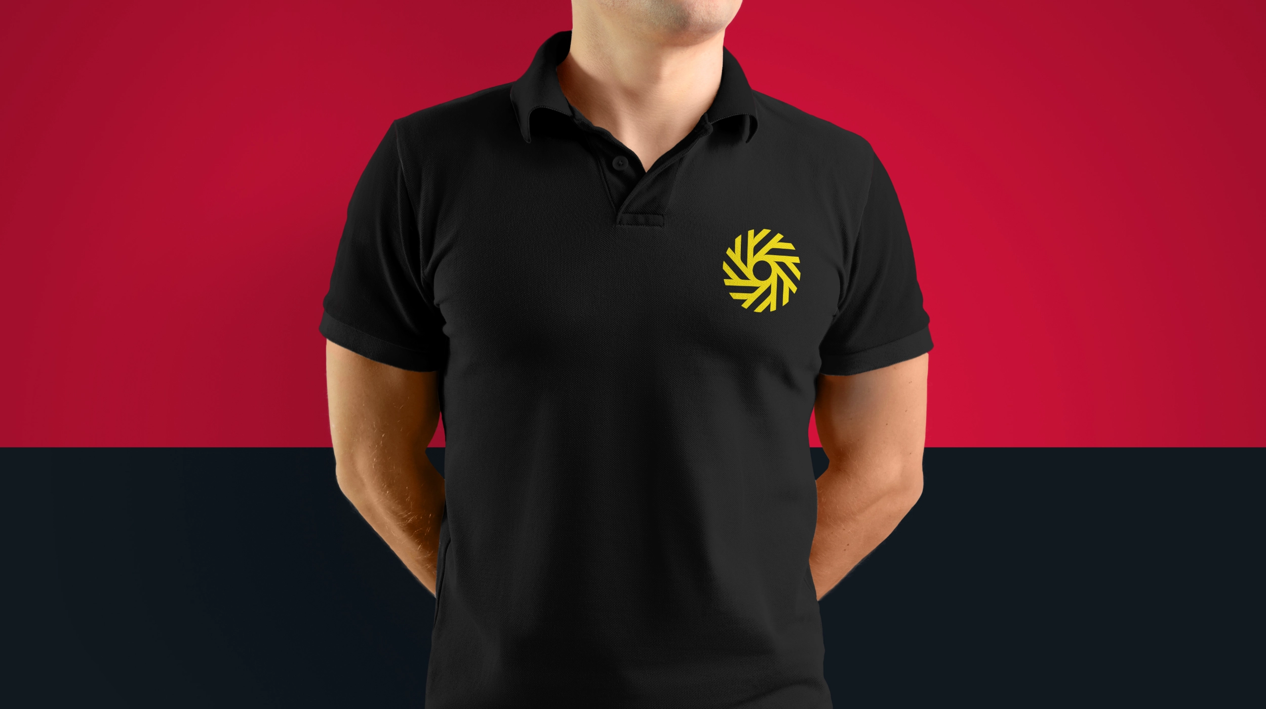
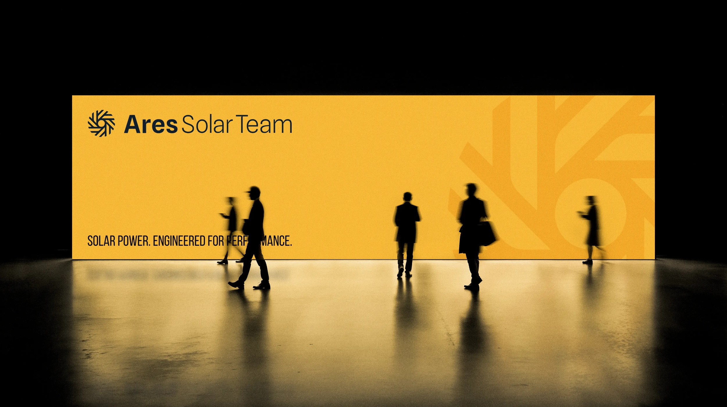
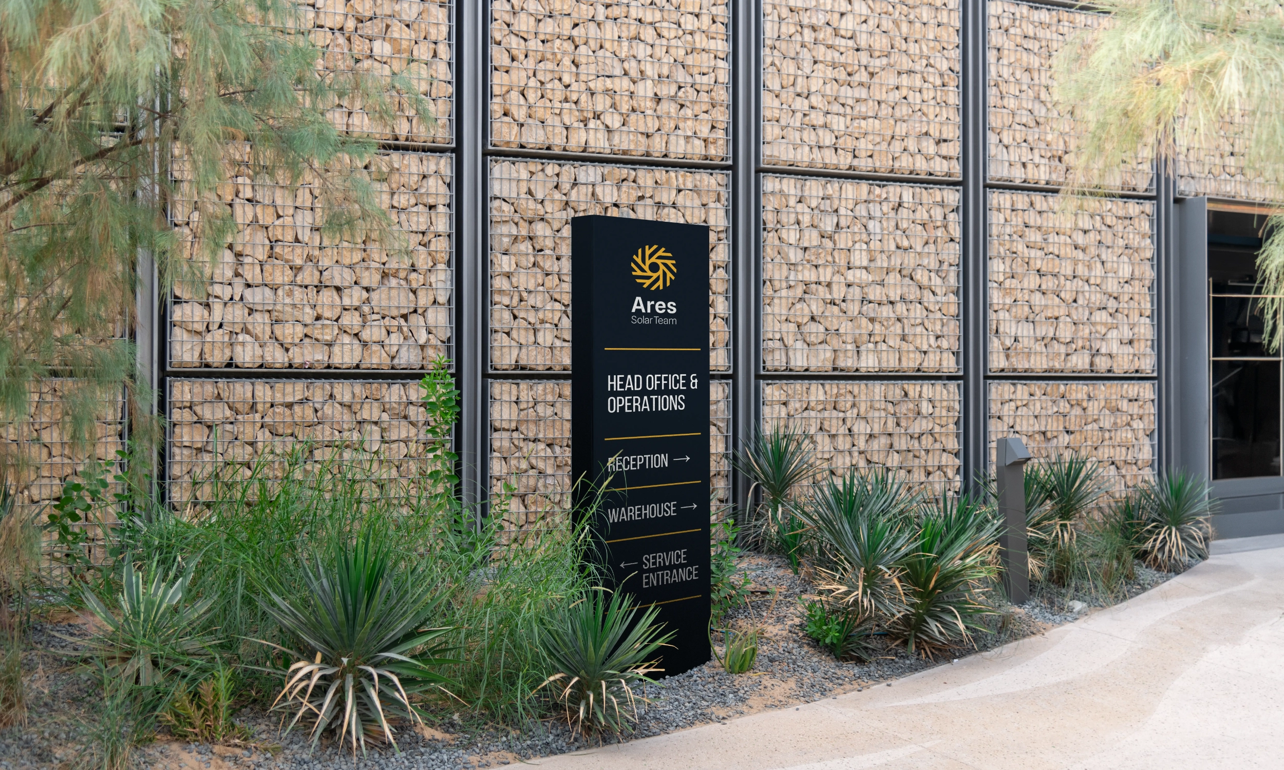
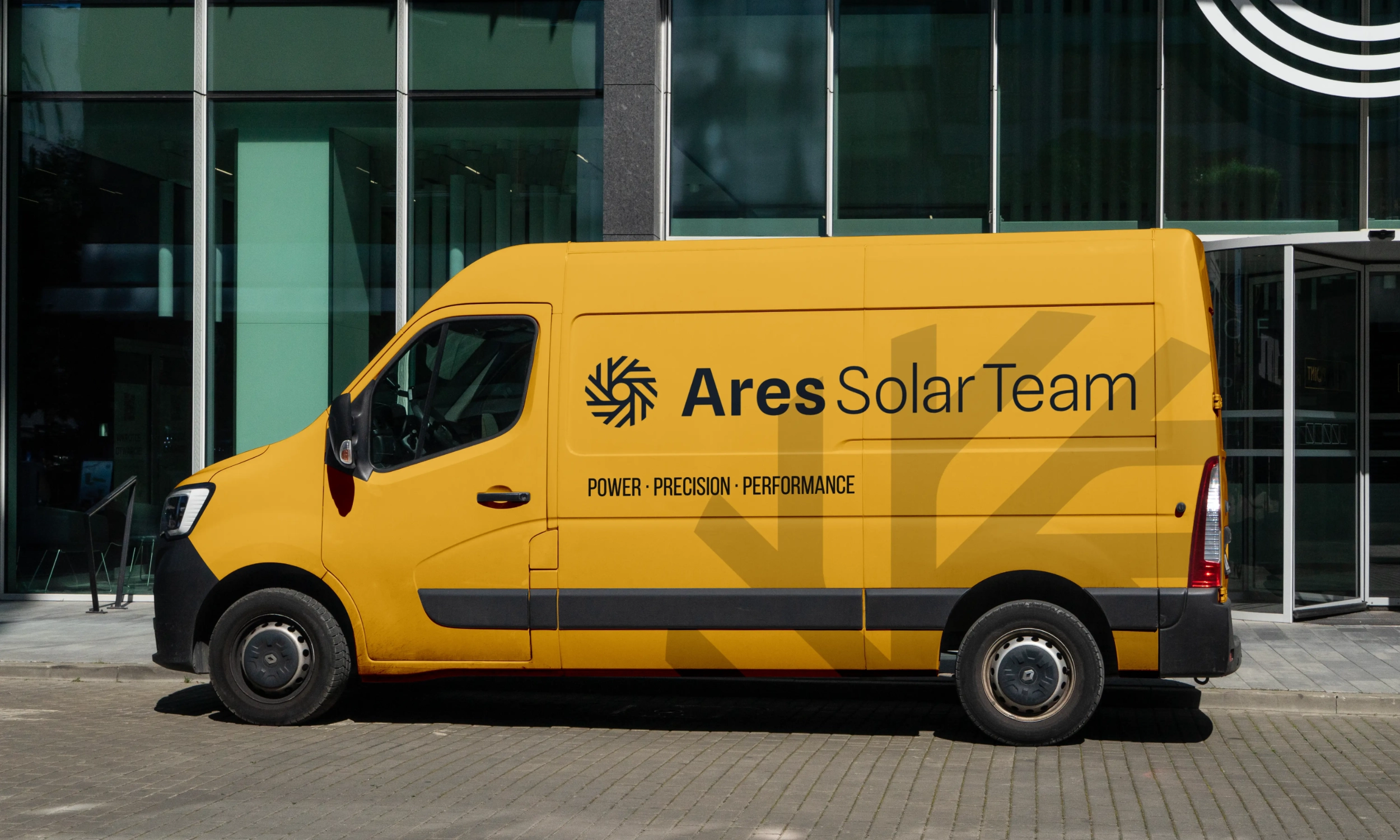
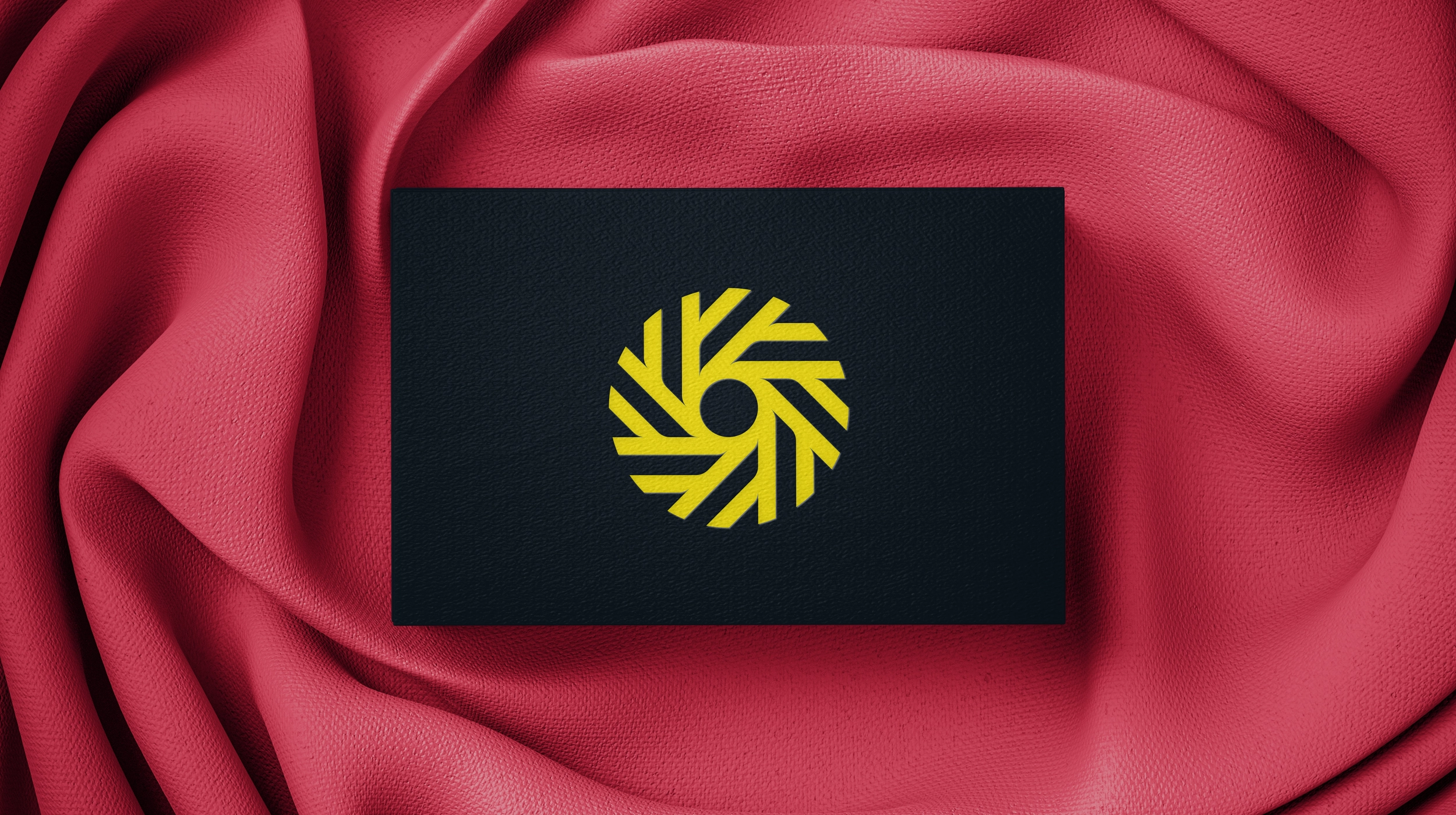
We created a system that combined strength with precision. The new mark distilled the sun into a rotor form, reflecting both energy and engineering. A palette of deep Night and vivid Sun ensured immediate recognition in the street and on the screen. Typography and grids were set with discipline, giving every layout structure and coherence.
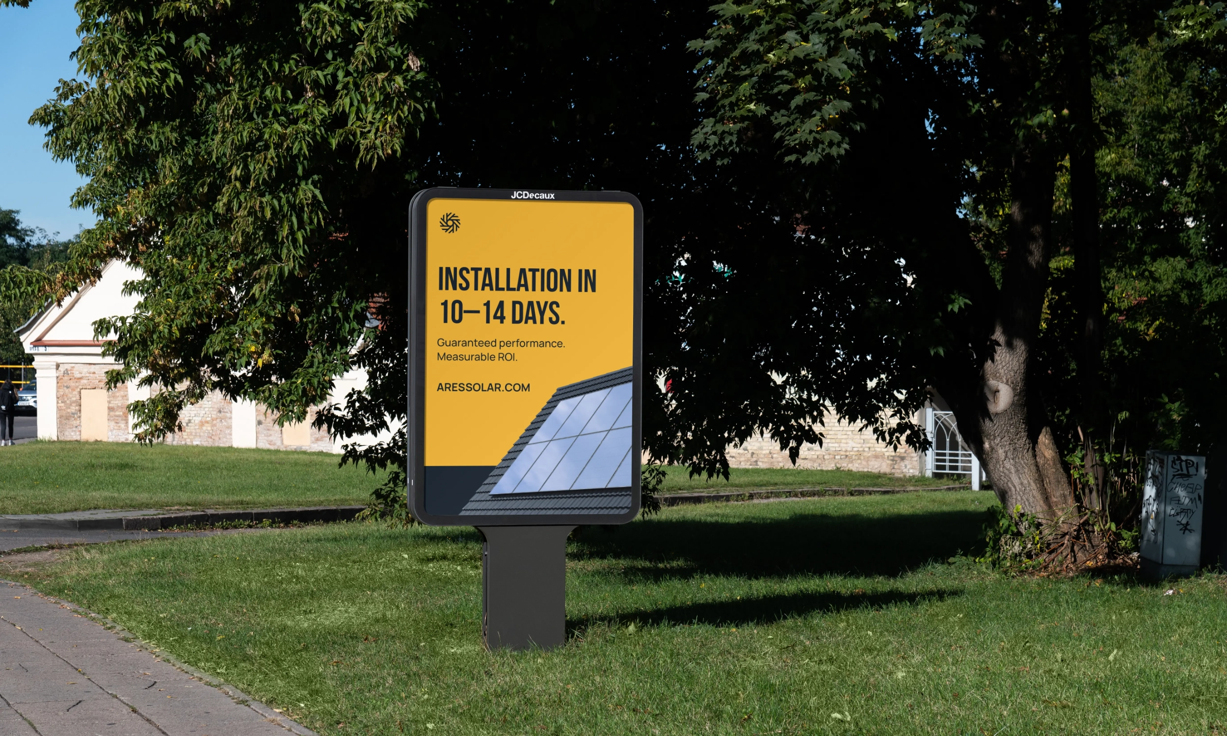
The identity was carried into fleet livery, safety wear, site signage, proposals, and a website that speaks in measurable outcomes. Copy was framed around speed of installation, return on investment, and warranty strength, aligning the brand story with the decisions customers actually weigh.

Result
Ares now projects confidence in a crowded industry. Their brand speaks with authority, looks unified from rooftop to billboard, and reduces the effort required to produce new materials.
Prospects see consistency, teams feel equipped, and the business can present itself as a credible alternative to larger, established players.